
When a major algorithm update rolls out, it’s often helpful to view hourly data in Google Analytics to see the impact in near-real time. If a site is impacted heavily (surging or dropping), you can typically see when the update actually lands and the stark difference in traffic when that happens.
One of my most popular blog posts is a tutorial about how to compare hourly trending in Google Analytics 4. Well, Google recently announced that the GSC API would support hourly data for the past 10 days. And based on my GA4 tutorial, I’m being asked how to view GSC hourly data when an update rolls out. Yes, you can compare hourly data, but just not in the GSC UI. You need to export the data via the GSC API and then compare. I’m going to cover how to do this today.
From The Announcement To Analytics Edge in Less Than 24 Hours:
As soon as Google announced that hourly data was indeed rolling out via the GSC API, I quickly pinged Mike Sullivan from Analytics Edge. Mike is the mastermind behind Analytics Edge, which works with both Excel and Google Sheets. And within a few hours, I had the first version of Analytics Edge that supported hourly data.
Below, I’ll quickly walk you through exporting hourly data, and charting that data, to compare clicks and impressions over time. Again, when a major algorithm update rolls out, it’s smart to view hourly data to see if your site is being impacted, when the update actually landed, and more.
Note, I’ll cover comparing clicks and impressions in this tutorial, but you can do much more with Analytics Edge and hourly data. For example, exporting query and landing page data by hour over the past X days (up to 10 days of data). And you can do this across Google surfaces like Images, Video, Discover, Google News, and the News tab in Search. The sky’s the limit with what you can do…
For this tutorial, you will need the Analytics Edge core add-in and the GSC connector. There is a free trial for both and the annual pricing is EXTREMELY cost effective. The core add-in is $99 for the year and the GSC connector is $50 for the year. I use Analytics Edge on a regular basis to export tons of GSC data, so it’s well worth it to buy a license in my opinion. To learn how to set up Analytics Edge, you can view my previous tutorials.
How to export hourly GSC data via Analytics Edge to compare timeframes:
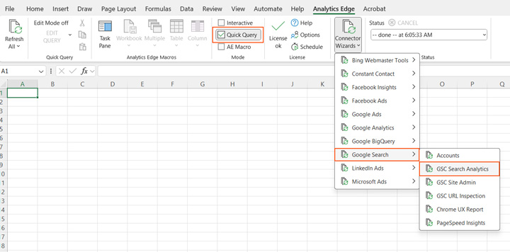
1. Fire up Excel and click Analytics Edge in the ribbon. Then hover over Connector Wizards, Google Search, and then click GSC Search Analytics.
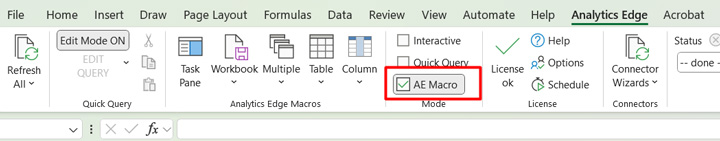
2. Note, make sure AE Macro is selected in the ribbon versus Quick Query to make sure you have a working macro that you can use in the future! That’s the beauty of Analytics Edge… build once and then leverage your creation for data efficiency in the future.
3. Select the site you want to export data for.
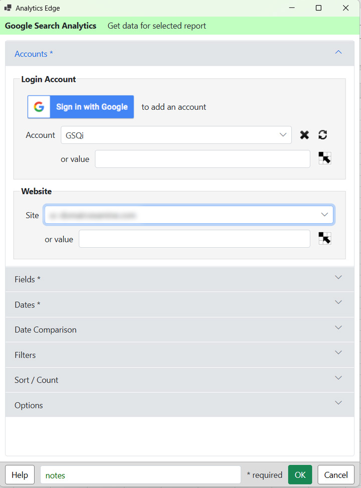
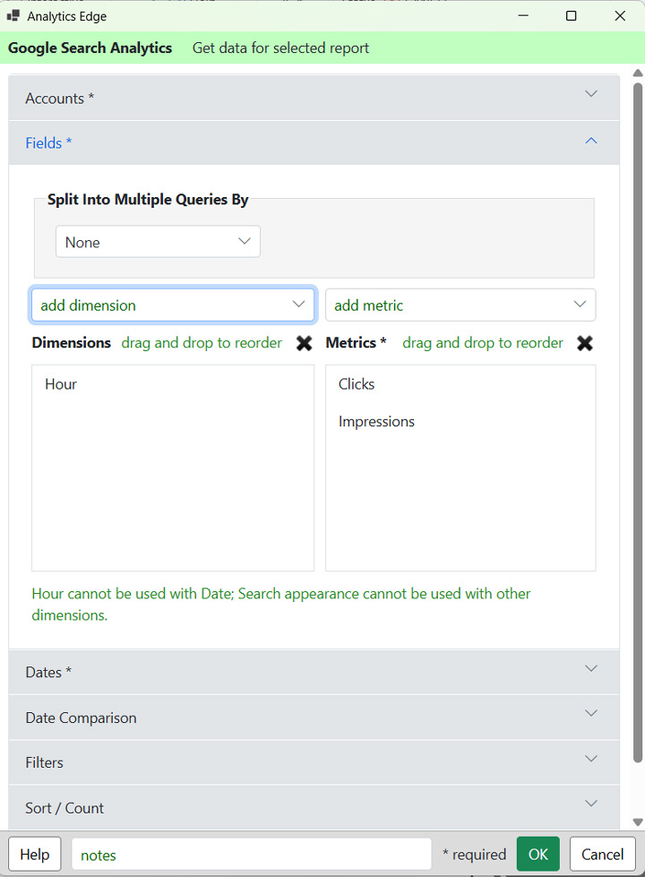
4. Next, click the Fields tab and add a dimension. We’re going to select Hour since we want hourly data. Then for metrics, make sure Clicks and Impressions are selected (which they should be by default).
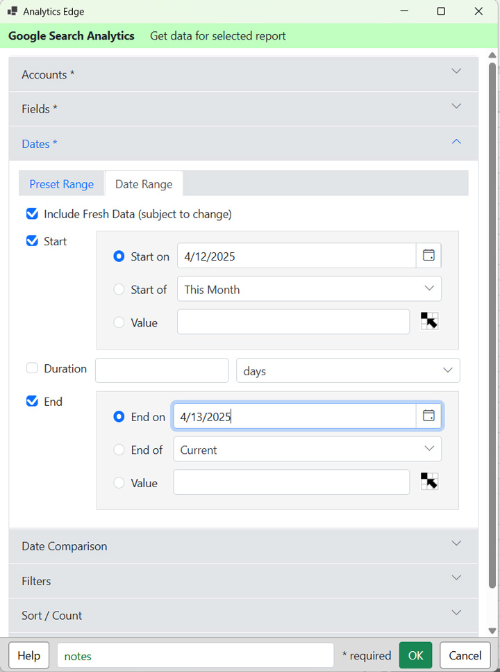
5. Now we want to select our dates to compare. You have 10 days of data you can choose to view for hourly data, but remember, we want to compare hourly (and it’s optimal to compare the same days of the week to see the most accurate trending). In addition, the current date may contain partial data. You can still export that, but keep in mind you might see a big drop-off that’s artificial. So to overcome this, let’s choose the past two days of full data and compare to the previous timeframe (keeping day of week consistent). Click the Dates tab and select Date Range. Then click the Start checkbox and choose 4/12/2025 which should have full data. Then click the End checkbox and select 4/13/2025, which should also have full data.
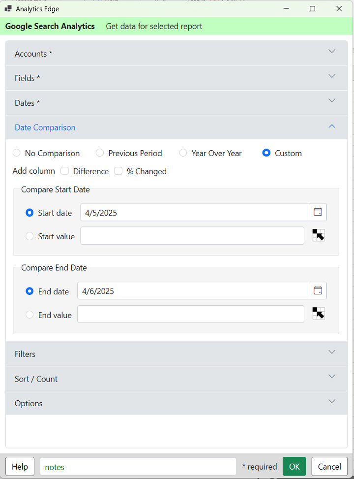
6. Now let’s make sure to compare the data to a previous timeframe. Click the Date Comparison tab and select the Custom radio button. Now select the Start Date and choose 4/5/2005 which keeps the day of week consistent. And then choose 4/6/2025 as the end date to compare.
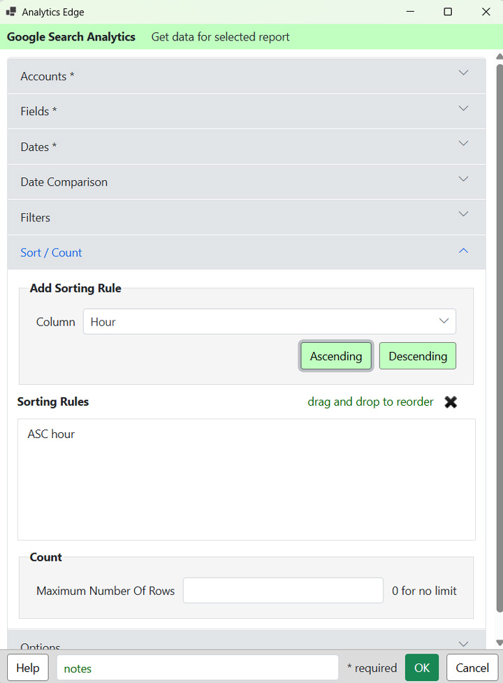
7. You can skip the Filters tab for this tutorial (and just leave the fields blank). For the Sort/Count tab, click the Column to add a sorting rule. Select the Hour column and then click the Ascending button. That will make sure the data is in the correct order hour-wise.
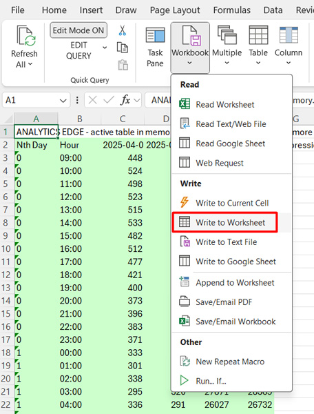
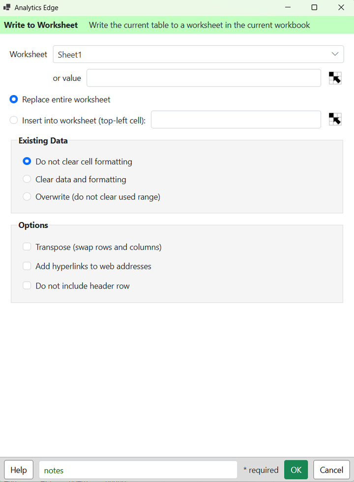
8. Click OK in the bottom right corner of the window and Analytics Edge will export the data you requested via the GSC API. When it’s done, you will see a green table holding the data in memory. You won’t see the full data since it’s a temporary table. In order to export the full data, you must write that data to a worksheet. So click the Workbook button the Analytics Edge menu and click Write to Worksheet. You can write the data to a specific worksheet or keep the default blank sheet in the field. Then click OK.
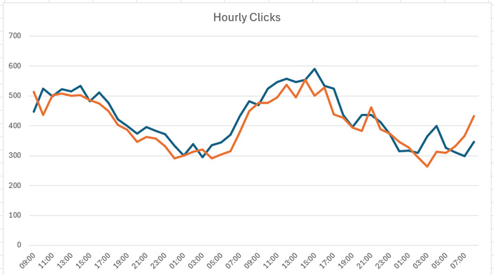
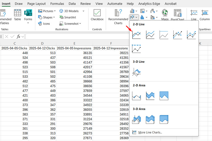
9. Now you should have a worksheet with all of the hourly data for two days with comparison data for two days in the past (keeping the day of week consistent). Now we just need to chart the data! Let’s start by comparing clicks over the timeframe. We’ll create a line chart to view trending data over time. You can start with a blank chart, but I like to start with the data highlighted and then create the chart. Then Excel does its thing and charts the data automatically. Select the Hour column and both Clicks columns (the current and previous timeframe for clicks). Then click the Insert menu in Excel and select a 2D line chart. And Voila, you should see trending for clicks by hour for both timeframes. Pretty cool, right?
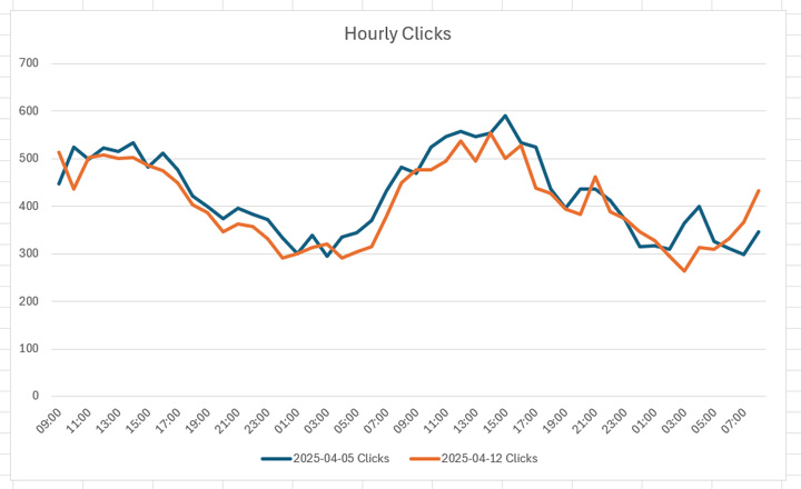
10. Then resize the chart, format the chart however you want, etc. You now have hourly clicks data compared to the previous timeframe (keeping day of week consistent)! Again, this can come in very handy when a major algorithm update rolls out.
Bonus: To compare impressions data in a new chart, first deselect the current chart in Excel. Then highlight the Hour column and then select the two Impressions columns while holding the Control button on your keyboard (selecting both the current and previous timeframes for impressions). Once those three columns are highlighted, insert a 2D line chart again and boom, Excel will create the chart comparing impressions for you.
Summary: Compare Hourly GSC Data During Major Algorithm Updates.
I love that Google added hourly data to the GSC API for up to 10 days. Now we can slice and dice that hourly data for many different reporting purposes. Today I showed you how to compare overall clicks and impressions while a major algorithm update rolls out, but you can do much more with query and landing page data. And if understanding hourly changes is important for your business (like for news and media publishers), then having a tool like Analytics Edge is super important. I might write more hourly tutorials in the future. Stay tuned.
GG
Source link